TileCardBanner
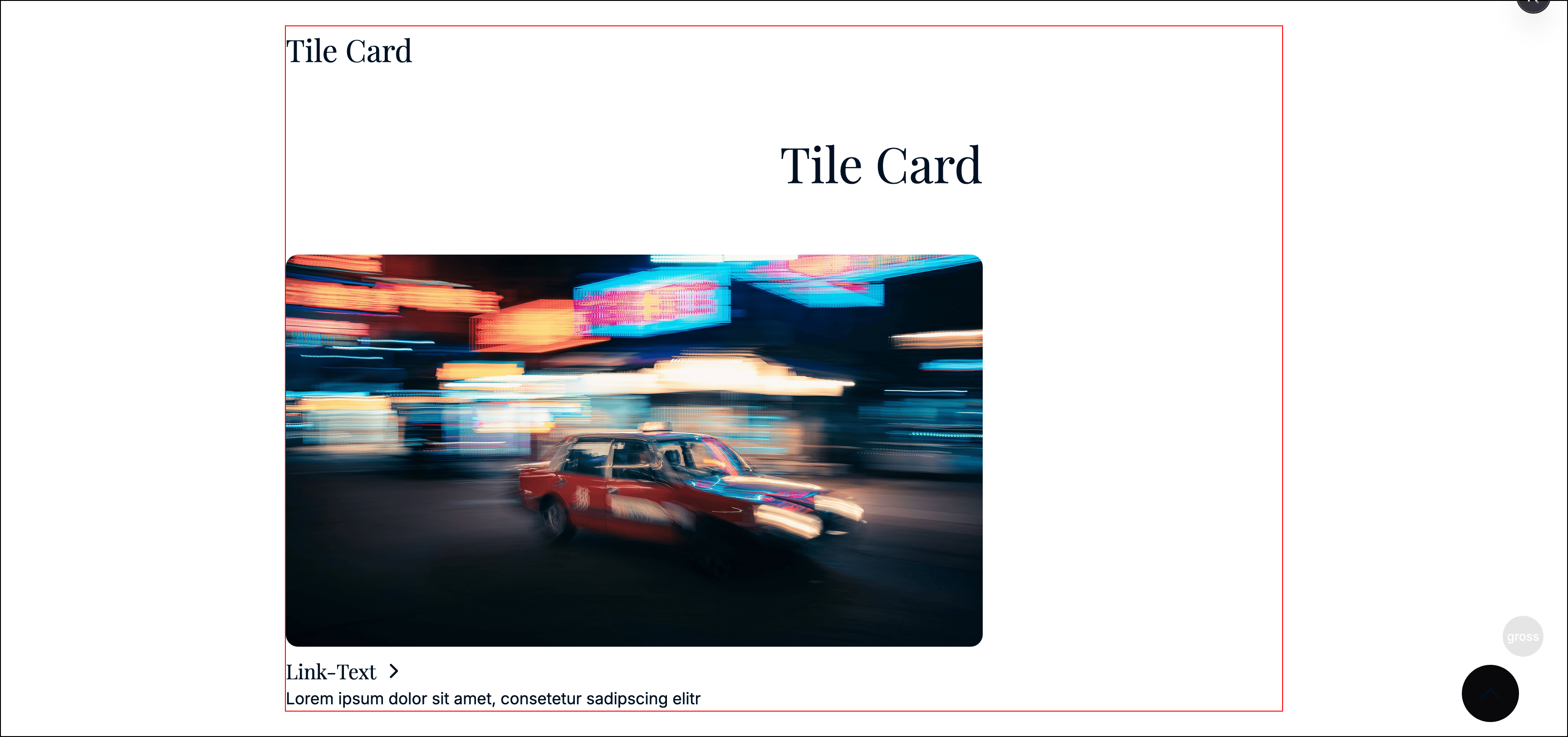
A single tile/card with image, text, and a link.
Includes the common banner props.
Props
id●required
string
CMS id.
linkText●required
string
CTA text displayed on the tile.
Destination link for the tile.
description●
Maybe<string>
Optional descriptive text.
Tile image.
fullsize●required
boolean
If true, the tile render larger and span more width.
Example
const banner: TileCardBanner = {
  typename: BannerTypename.TileCard,
  id: 'b_123',
  title: 'Service',
  titleTag: 'h2',
  titleAlign: 'left',
  cssId: null,
  cssClasses: null,
  linkText: 'Learn more',
  url: { label: 'Learn more', isAbsolute: false, url: '/service', query: [] },
  description: 'Short teaser...',
  image: { id: 'img1', name: 'Service', imageRights: null, file: { /* ... */ } as any, mobileFile: null, alt: 'Service', breakpoint: null, cars: [] },
  fullsize: false
};
Last updated on