ButtonBlockBanner
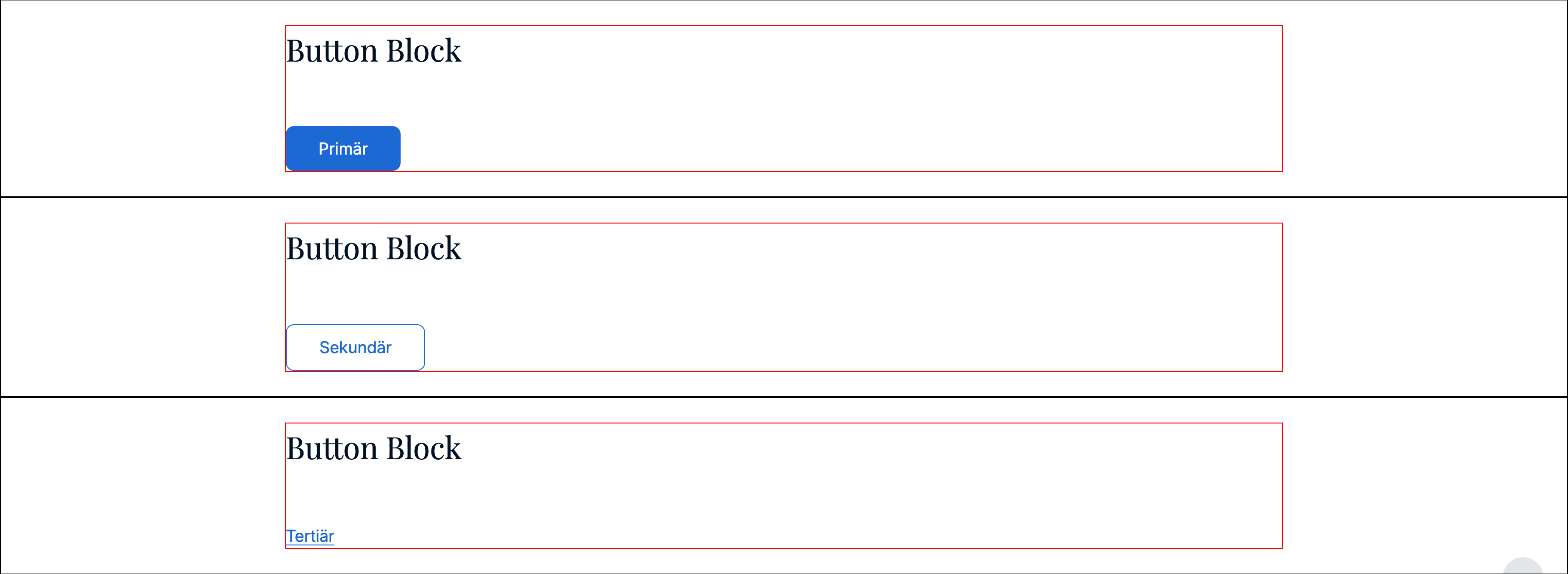
Single button block.
Includes the common banner props.
Props
id●required
string
CMS id.
button●required
ButtonProps
Button configuration (same shape as used in HeadlineBlockBanner).
text: label
url: link
style: visual variant
contactForm: optional form config
Example
const banner: ButtonBlockBanner = {
  typename: BannerTypename.ButtonBlock,
  id: 'b_123',
  title: null,
  titleTag: 'h2',
  titleAlign: 'left',
  cssId: null,
  cssClasses: null,
  button: { text: 'Contact', url: { label: 'Contact', isAbsolute: false, url: '/contact', query: [] }, style: 'primary', contactForm: null }
};
Last updated on