SimpleTileCardsBanner
Collection of simple tiles/cards.
Includes the common banner props.
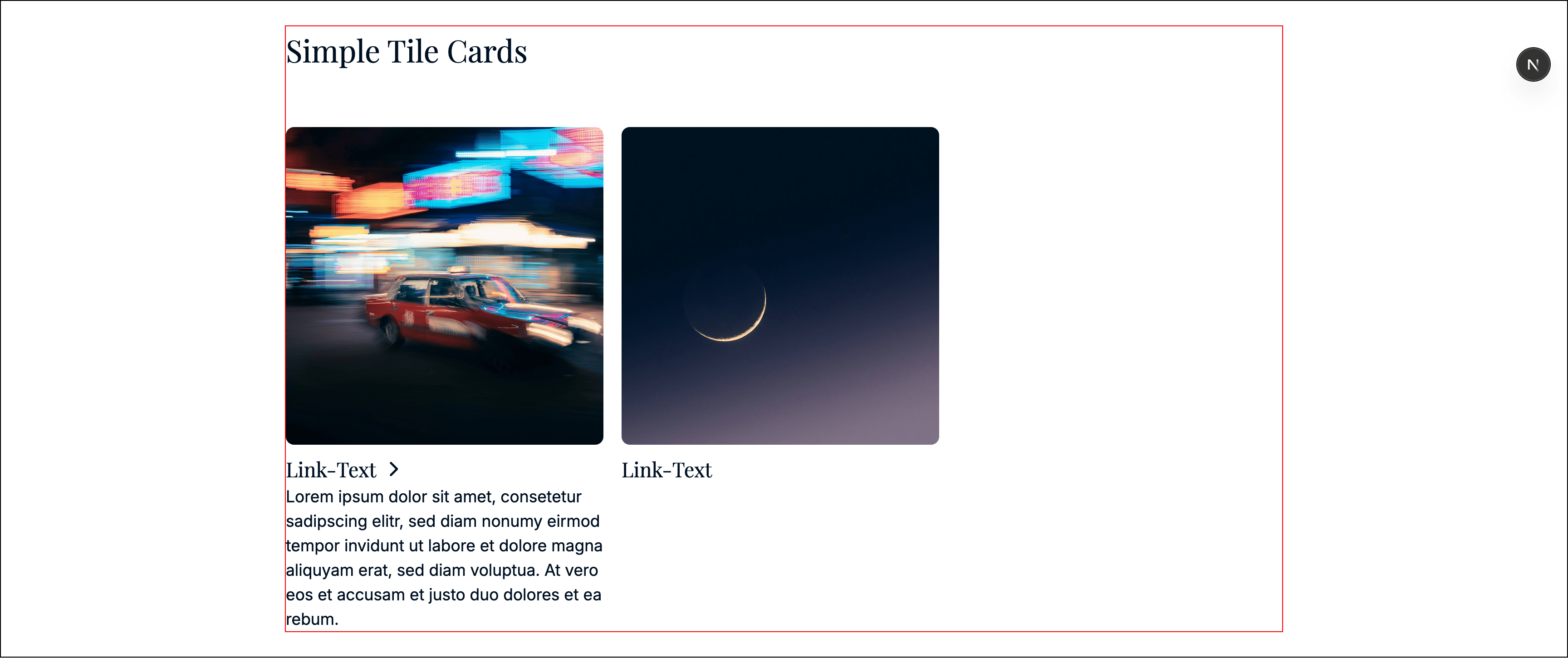
Types
type BannerListItem = {
  id: string;
  document: KeystoneDocument;
  nativeIcon: string | null;
  image: ImageProps | null;
  link: DynamicLink | null;
};
Props
id●required
string
CMS id.
items●required
BannerListItem[]
Tiles rendered in order.
Notes
- If
linkis null, the tile is rendered non-clickable. - The image is optional.
- Use
ImagePropsfor the tile image.
Example
const banner: SimpleTileCardsBanner = {
  typename: BannerTypename.SimpleTileCards,
  id: 'b_123',
  title: 'Topics',
  titleTag: 'h2',
  titleAlign: 'left',
  cssId: null,
  cssClasses: null,
  items: [
    {
      id: 't1',
      document: [
        { type: 'heading', level: 3, children: [{ text: 'Open' }] },
        { type: 'paragraph', children: [{ text: 'Short teaser...' }] }
      ],
      nativeIcon: null,
      image: { id: 'img1', name: 'Topic', imageRights: null, file: {} as any, mobileFile: null, alt: 'Topic', breakpoint: null, cars: [] },
      link: { label: 'Open', isAbsolute: false, url: '/topic', query: [] }
    }
  ]
};
Last updated on