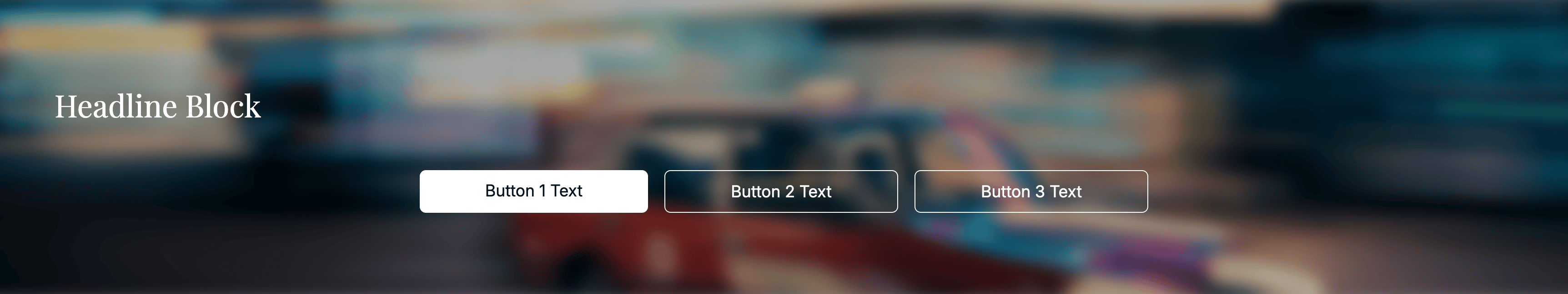
HeadlineBlockBanner
A headline section with a background image and one or more buttons.
Includes the common banner props.
Types
type ButtonProps = {
  text: string;
  url: DynamicLink;
  style: 'primary' | 'secondary' | 'tertiary';
  contactForm?: DynamicForm | null;
};
Props
id●required
string
CMS id.
Background image.
buttons●required
ButtonProps[]
Buttons rendered within the banner.
text: button label
url: destination link
style: visual variant
contactForm: optional form config (if present, button opens a form)
Example
const banner: HeadlineBlockBanner = {
  typename: BannerTypename.HeadlineBlock,
  id: 'b_123',
  title: 'Need help?',
  titleTag: 'h2',
  titleAlign: 'center',
  cssId: null,
  cssClasses: null,
  background: { id: 'img1', name: 'Hero', imageRights: null, file: {} as any, mobileFile: null, alt: 'Background', breakpoint: null, cars: [] },
  buttons: [
    { text: 'Contact', url: { label: 'Contact', isAbsolute: false, url: '/contact', query: [] }, style: 'primary', contactForm: null }
  ]
};